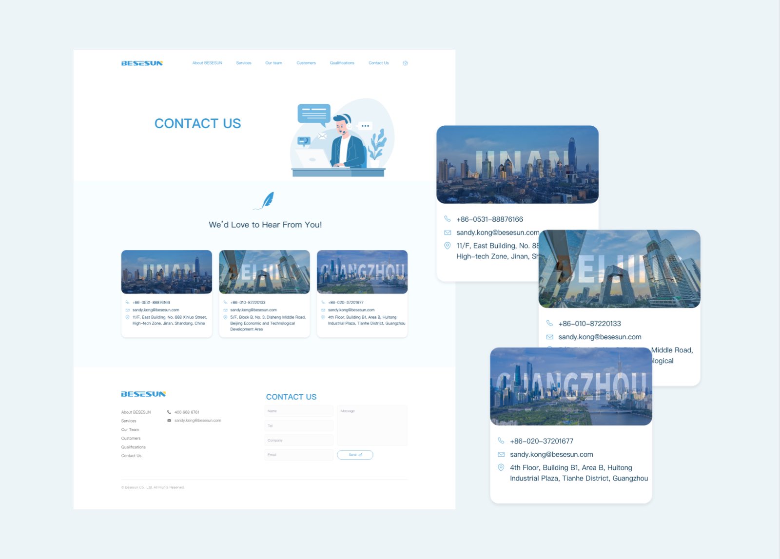
Product websites

CASE STUDY / Brand websites
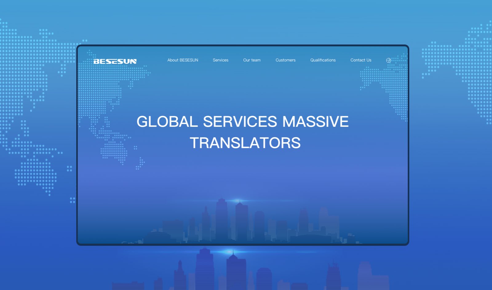
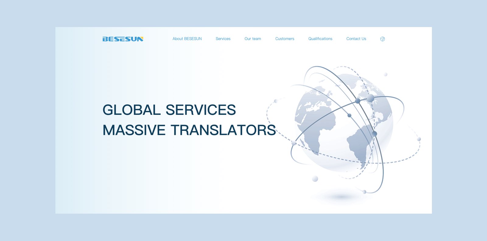
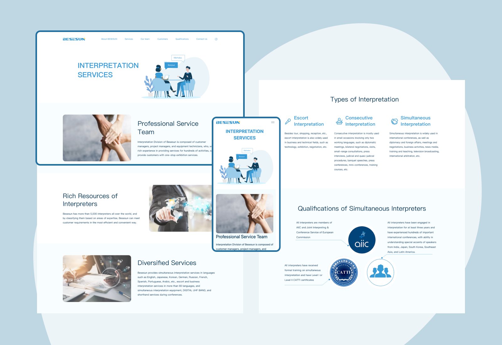
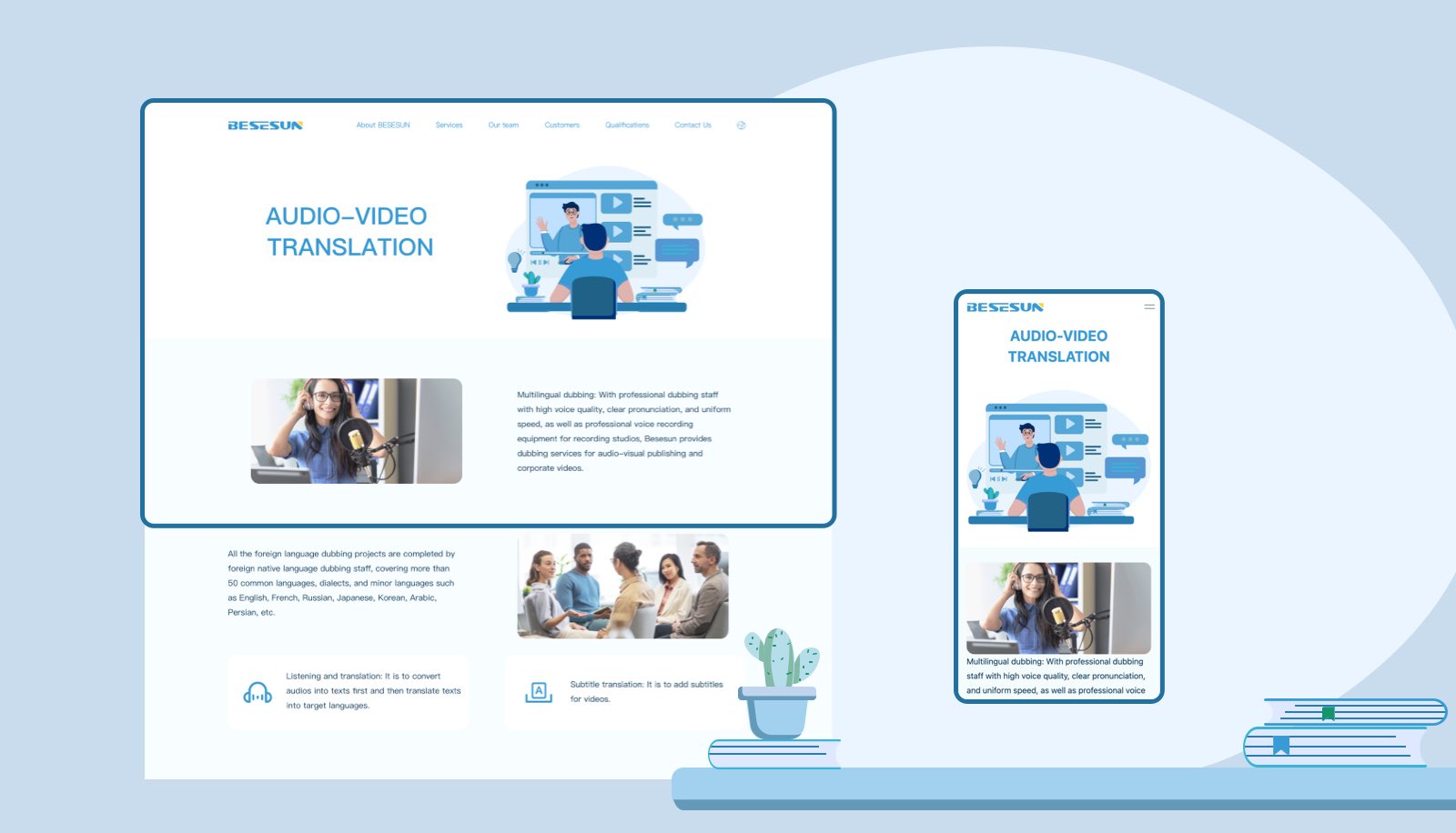
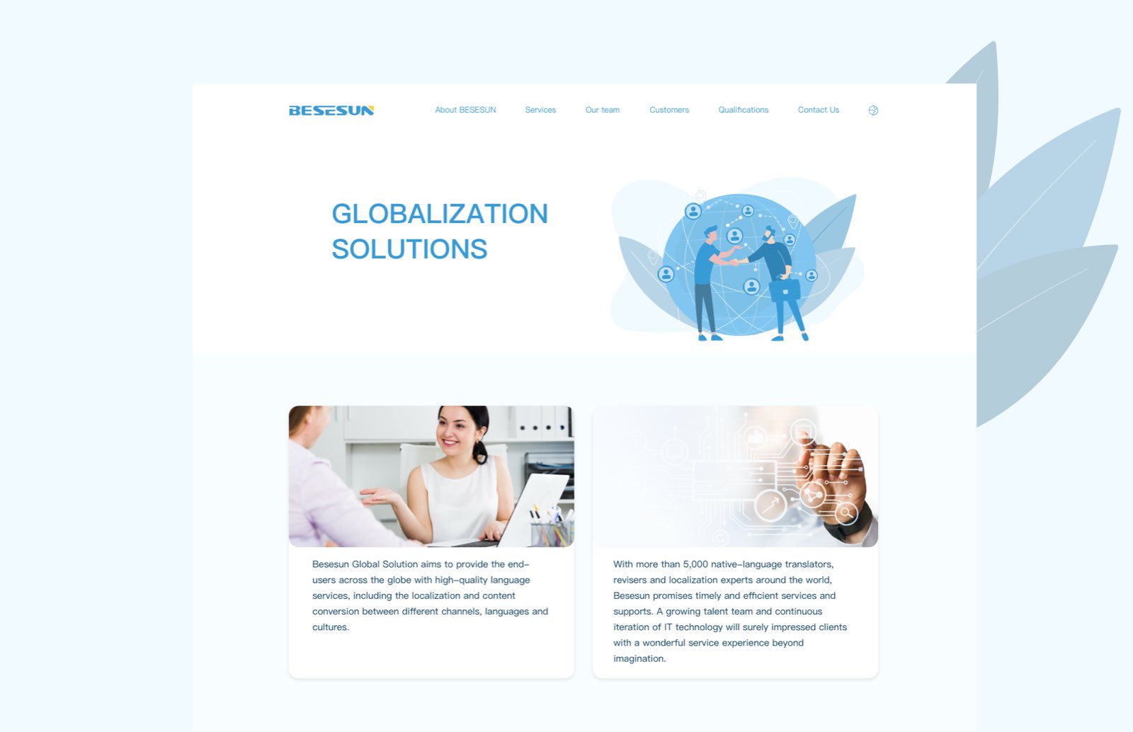
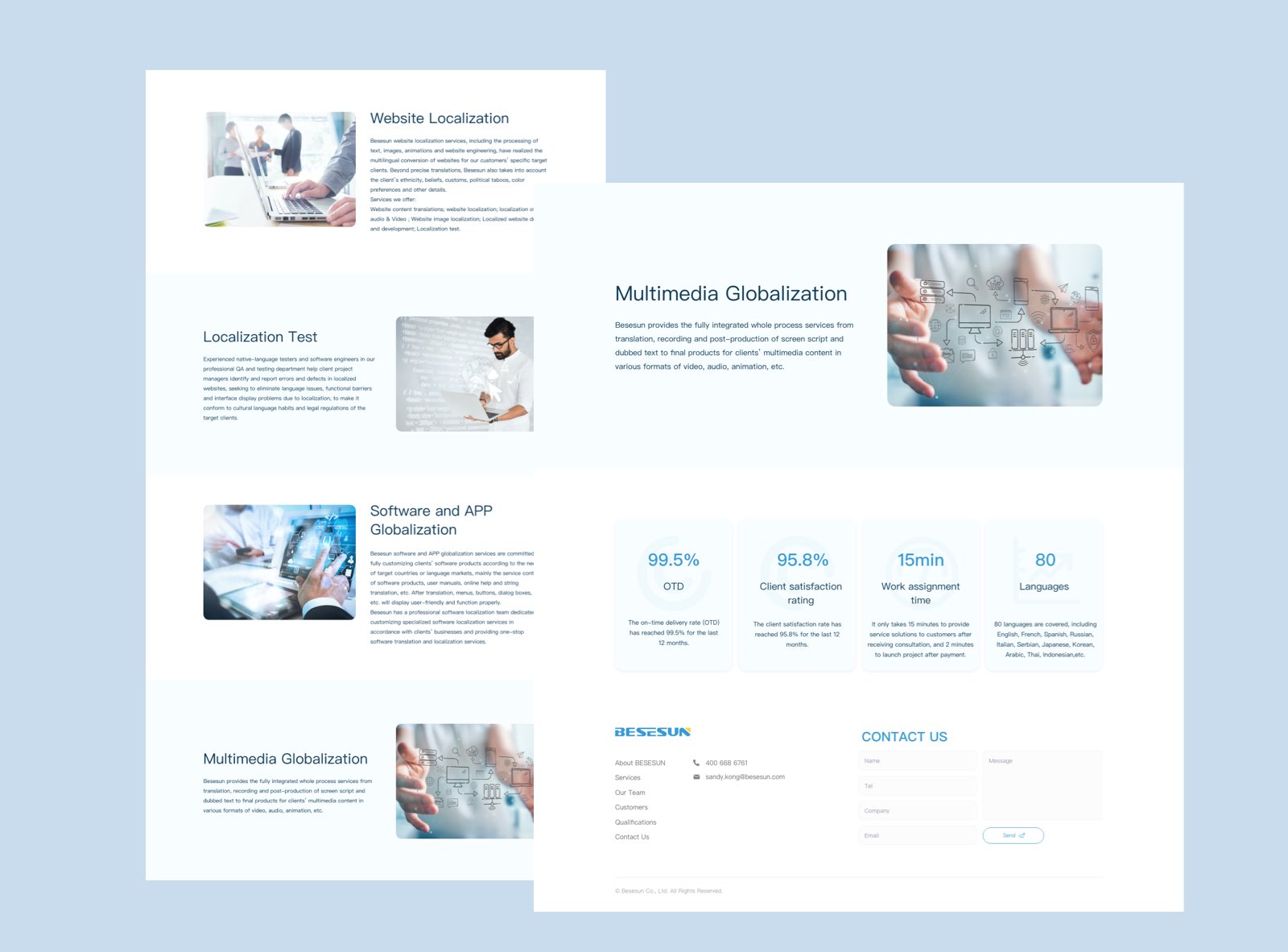
An international language services website with a clear visual hierarchy, brand-led colour and approachable illustration.
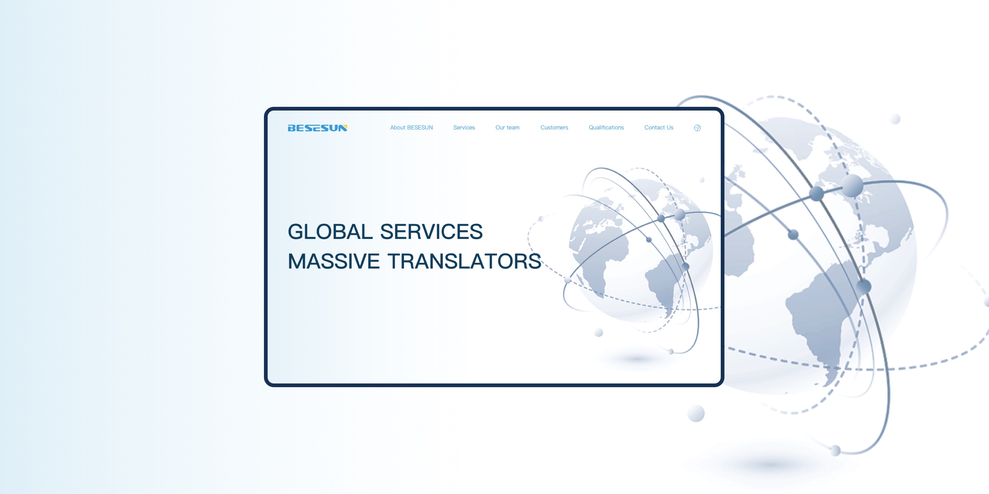
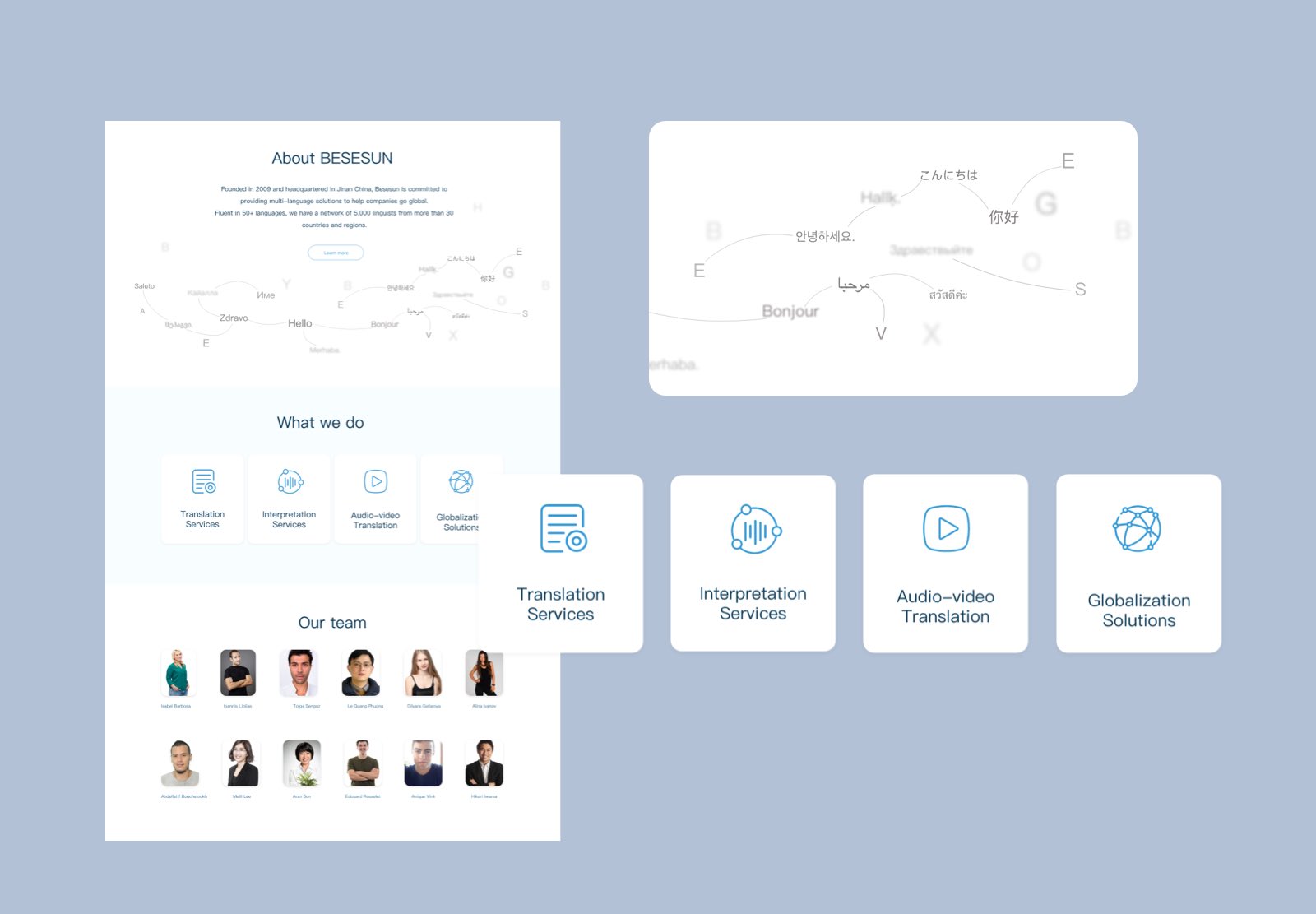
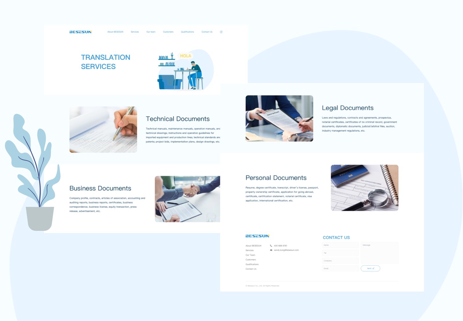
Besesun is a language solutions provider with translation at the core of its business. Its clients include thousands of established companies.
The website takes its colour direction from the company’s logo and combines it with complementary professional tones. Illustrations and concise graphic communication make company information easy to understand. Clear categories and uncluttered layouts support an international audience and a consistent brand identity.